How to make a presentation on your research
- Basic requests -
13 August, 2018 SoK
Objectives
(1) Presentation is for not you but audiences.
Slides should not be used for your explanation. Sometimes we see that only
a presenter satisfy and audience can not understand the presentation. Presentation
has to make audiences to understand what you want to mention. This is the
most important thing.
(2) Presentation has to have a story.
You should not include slides with different topic out of the story. We
can see a talk jumping about in some directions. This is too difficult
to understand it.
(3) Speak loudly with gestures.
Small voice is bad. Gestures are attractive.
Time control
(1) Fundamentally you use 1 slide for 1minute. Totally you must keep the number of slide less than 10% plus of this rule.
Do not pass a decided time. So, if you have 10 minutes for presentation,
the over limit of slide is 11 slides.
You must do this.
(2) You can use the last slide of conclusions to adjust the time. If you
have more time, you explain the last slide. If you do not have, you should
just show it and stop your presentation. In this case, you keep the last
slide on a screen.
Structure
Basic structure is recommended as follows.
(1) 1. Background, 2. Literature review, 3.Objectives, 4. Study area, 5. Data used, 6. Methodology, 7. Results, 8. Discussion, 9. Conclusions.
This structure depends on presentation time. You can change the structure.
You should emphasize remaining problems on objectives and new findings
or new productions on discussion or conclusions.
(2) Each slide of results and discussion has description conclusions of the each slide. What you want to say on the slide should be described.
You have to do these.
(1) You do not use small font!!
If audiences cannot see the letters, this is same as no letters. You must
use letters larger than 20pt on power point. . Even captions on an axis
and an units are also more than this. This is minimum size. You had better
use letters more than 24pt.
Absolutely do not use small font.
(2)Omit unnecessary information
Do not include values and figures, which you do not explain. A busy slide
is not acceptable. Simple is the best.
(3)Raw figures are bad
Only a graph and a photo are typical bad example. The graph needs processing.
You can add more information such as trend, a critical point and interesting
zones. You have to provide understandable explanations for the slide.
(4) Conclusions for objectives
Conclusions should answer for research objectives.
Above things are for (1) of objectives of presentation.
Frequent bad slides
(1) You do not need all info!!

What many descriptions. Can we see all? There are no additional explanations.
Hate small letters.
(2) A stupid slide by a stupid presenter

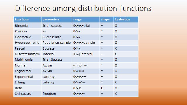
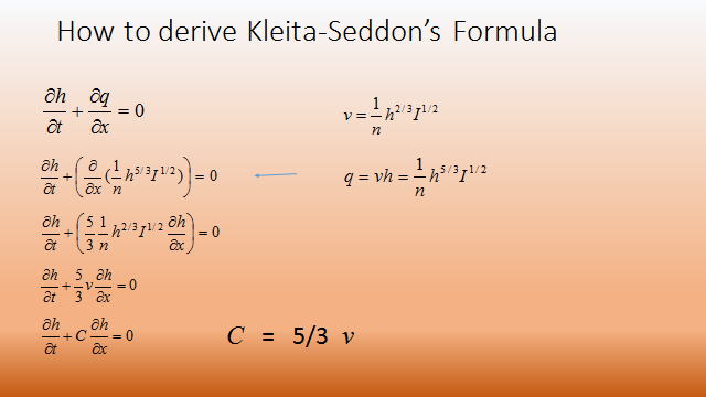
No definition of variables and No explanation. There are no explanations and conclusions.
(3) Just transfer a graph to slide

No additional information on what you want to say. Small letters on axis
are not acceptable.


